Fintech Dashboard
We turned a dense fintech product into a story people understand in one scroll. Cleaner narrative, fewer decisions, stronger trial starts.
Why this design works
Most fintech sites drown visitors in features. We flipped the script with an arc that moves from pain → proof → payoff. Refined type, a focused color system, and restrained motion reduce cognitive load while making the product feel premium and safe.
A layout that tells a story
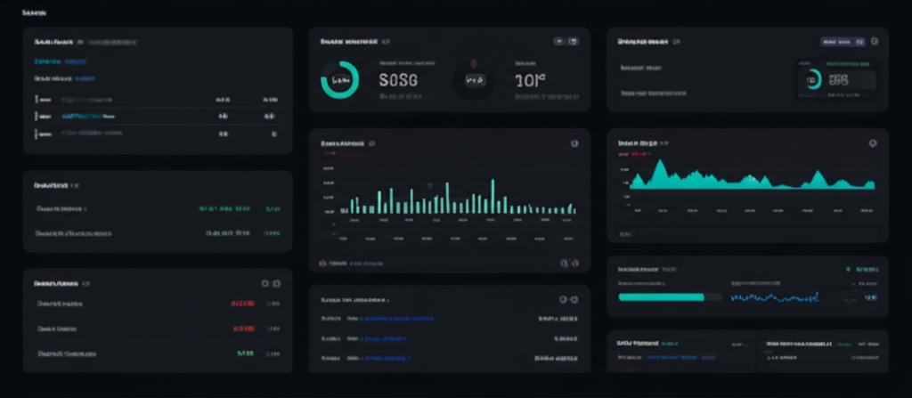
An editorial hero sets the promise, followed by a proof bar, guided product sections with diagrams, and a conversion‑ready footer. Every module is reusable so the team can mix and match for future launches and campaigns.
Development that doesn’t get in the way
Built with Next.js Server Components on Vercel for speed and reliability. We shipped accessible UI, image optimization, and tidy analytics events. Framer Motion adds micro‑interactions that feel delightful without hurting performance.
What this delivers for their team
- Visitors grasp the value in seconds — not minutes.
- Lower bounce rate and a lift in trial starts.
- A composable section library that accelerates future pages.